Issue, No.29 (March 2024)
Isogini as a Set of Indicators to Compare Trends and Shapes of Income Inequality: The Fading Swedish Middle-Class Society in a World of Diverse Dynamics
Recent data from Sweden and other LIS countries highlight emerging dynamics in inequality, presenting an opportunity to reassess approaches to measuring inequality. Debates surrounding the conventional Gini index (referred to as “gini” hereafter) have spurred inquiries into alternative methodologies for measuring income inequality1. The same Gini coefficient can encapsulate markedly different distribution patterns (Osberg, 2017). As the Gini index offers an overall measurement of inequality across the entire distribution, the notion of “concentration of inequality” (Blesch et al., 2022) at the upper versus lower ends of the distribution, underlines the need for tailored measurements at various percentile levels.
Literature suggests supplementing gini with diverse metrics, such as various decile ratios or other indicators like the percentage of persons at risk of poverty (ex. the proportion of individuals below 50% of the median income, referred to as “arop” hereafter). Sophisticated approaches like the Ortega parameters have been proposed (Blesch et al., 2022). However, a challenge persists in comparing these disparate measures, given their distinct conceptual frameworks, magnitudes, and scales. While the Gini index serves as a standard benchmark with well-established metrics (0 signifies perfect equality and 1 perfect inequality, with empirical variations of gini below 0.25 characterizing equalitarian countries to above 0.5 with high inequality like in Latin American nations), other metrics like decile ratios or arop lack direct linkage to gini, making comparisons difficult. Even the utilization of multi-y-axis graphs fails to elucidate such comparisons
The purpose of this paper is precisely to elaborate and empirically test a new family of inequality indicators, gini-comparable, and pertaining to different levels of the distribution to measure “concentration of inequality” at different levels. Isoginis are calculated, here at percentile thresholds 0.1 (lower decile), 0.9 (upper decile) and 0.5 (median), to represent inequality at, say, near-poor, near-median, and near-rich income levels. Isoginis are empirically comparable to the traditional gini. The STATA module ssc install isogini, available in lissy as well, implements this new set of measurements.
A typical case: Sweden and the decay of a middle-class society
Commencing with a remarkable case, new data from Sweden2 will illustrate different complementary measures of inequality. The systematic use of 95% confidence intervals facilitates determination of significance:
- In Sweden, the median density indicator (md: the ratio of the proportion of incomes ranging from 0.9 to 1.1 times the median, by 0.2, the width of the income bracket, see Figure in Methodology), plummeted by one third in the last two decades (see Fig.1.a). This indicates a significant erosion of homogeneity within the Swedish middle class. Contrasting with its past as a global model of equality (with md up to 1.2), Sweden’s current state (with md=0.82 in 2021), Sweden now lags near countries like France, Germany, and the Netherlands. The 95% confidence intervals confirmed the statistical significance of this transformation.
- Complementing this, the ratio d9/d5 (see Fig.1.b) shows that the income disparity between the top decile and the median has expanded from 1.5 times to 1.75 times, representing a relative growth of 17%.
- Symmetrically, the d1/d5 lower decile to median ratio (see Fig.1.c) declined, showing a sudden drop immediately after 2005, falling from 0.58 times to 0.50 the median, constituting a sudden (in 5 years) relative loss of 14%, this acceleration suggesting the complexity in inequality dynamics.
- The traditional gini (see Fig.1.d) shows a quasilinear increase of inequality ranging from 0.2 in 1981, signifying extreme equality, to 0.28, a level commonly observed across much of continental Europe. Overall, gini and d9/d5 present remarkably similar evolutions beyond the differences in scales.
Figure 1. Median Density (green) compared with gini (black), d9 (blue) and d1 (red), Sweden 1975-2021 (95% ci)
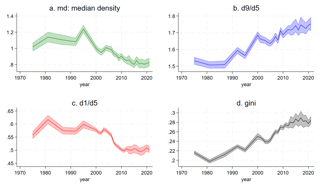
Sweden is no longer a world model of equality and socio-economic homogeneity, particularly in terms of median density (md). Inequality expansion are substantial at the upper end (d9), the lower end (d1), and overall (gini), but with different rhythm. A complete 3D view of the income density confirms the compression at the median3. The first phases of this deep transformation were identified a decade ago by Gornick and Jäntti (2013) in their book on the Western middle classes. Yet we now possess confirmation of its magnitude. Ironically, Sweden’s decision to cease microdata disclosure post-2005 occurred precisely when these significant societal shifts unfolded. No other country in the LIS database exhibits a comparable seismic upheaval in inequality at the median.
The current methodological issue is the comparison between these indicators at the center, lower or upper end, since the four metrics are intrinsically different. The innovative Isogini indicators provide a solution (see methodology), with Isogini(0.1) representing the Gini coefficient for the lowest decile threshold, Isogini(0.9) for the upper decile threshold, and Isogini(0.5) for the median level, all measured on the same scale as the traditional gini.
Figure 2. Isogini(p) for p=0.1 (red), 0.5 (green), 0.9 (blue), and the traditional gini (grey), Sweden 1975-2021
Five key insights emerge from the analysis of the four indicators in Sweden (see Fig. 2):
- Isogini(0.1) is in general above the other curves, in particular after 2005, while isogini(0.9) remains below. This means that in Sweden, inequality is stronger at lower incomes, with isogini(0.5) falling in between, closer to isogini(0.1).
- In 2000, the four indicators exhibited relatively similar values, close to 0.25, meaning the distribution was similar to a Fisk(0.25) (see methodology) whereas by 2021, the magnitude of inequality at the lower end was significantly stronger than at the top.
- Prior to 1995, inequalities were stable and low, followed by a clear acceleration in the 2000s’, particularly for isogini(0.1).
- The traditional Gini index for Sweden appears to be an average of the isoginis.
Overall, the four indicators have shown significant increases since the 1990s, albeit at varying rates, underscoring their relative autonomy from each other.
Methodology: isogini(p), an equivalent of gini at percentile p
The isogini(p) quantifies inequality at a specified percentile levels p (0<p>1, here, p=0.1, 0.5, and 0.9) within a distribution M through a metric that ensures comparability with the Gini coefficient. Here are considered quantiles, percentiles, deciles, etc. thresholds, like d1 for the first decile threshold, the income level that separates the lowest decile group D1, the group of the 10% poorest population to the rest. Symmetrically, d9 decile threshold is the lowest income of decile group D10, who are the individuals constituting the 10% richest in the population. But, exception, we consider only quantile threshold, not groups.
Consider distribution M, which typically represents the medianized equivalized disposable household income (medhi) of a country cc in the year yyyy (e.g., us2023 for the medhi distribution in the United States in 2023) and m(p) is the income at percentile threshold p. Since M is a medianized distribution, m(p=0.5)=1. The isoginiM(p) = ln(m(p)) / logit(p), where logit(p)=ln(p/(1-p)). This new set of indicators relies on the isograph (Chauvel, 2016), a representation of distributions where the x-axis is logit(p) and the y-axis is isoginiM(p). Isographs are generally close to flat lines plus some fluctuations.
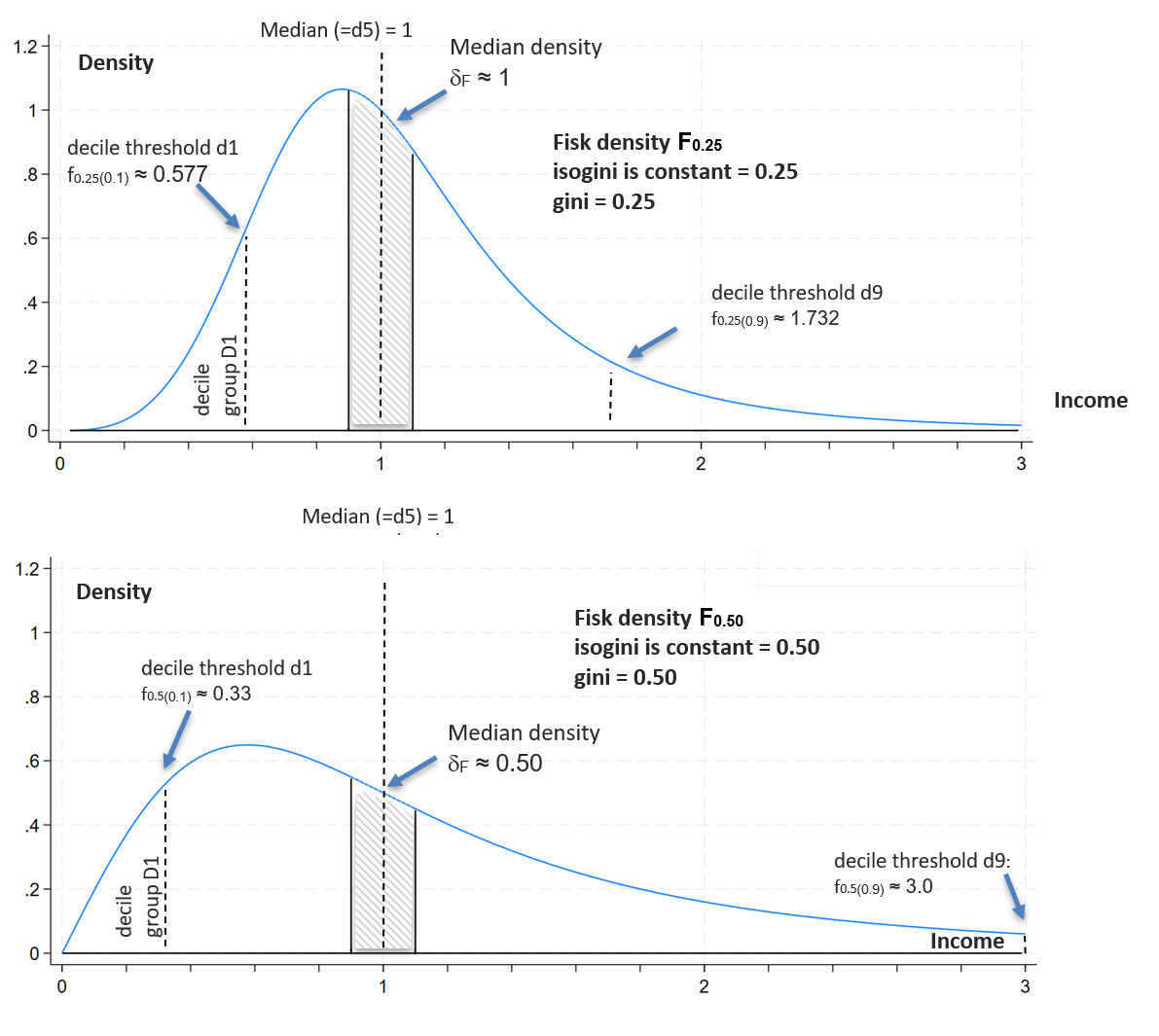
Consider Fγ, the medianized log-logit (aka. Fisk 1961) distribution of coefficient γ:
fγ(p) = exp(γ logit(p)) = (p/(1-p))γ
A notable characteristic of Fγ is that its Gini coefficient is equal to γ (Dagum 1977), and IsoginiF(p) is the constant γ. Consider isoginiM(p) defined as the gini γ of the Fisk distribution Fγ where fγ(p)= m(p). Consequently isoginiM(p) = ln(m(p)) / logit(p). IsoginiM(p) is the gini of the Fisk with income at percentile level p: f(p)=m(p). The Fisk distribution has a sense in the sociological study of stratification, in relation to the PSI, the Positional Status Index (Tam, 2016). An increment of 1 unit in the ln(PSI)=logit(p) across the social hierarchy corresponds to an increment of γ (the Gini coefficient) in the logged-income ln(y). The higher γ, the wider the income steps on the social ladder.
Here, isoginis are defined at decile thresholds d1, d5 (median) and d9. Since isoginiM(0.5) is not defined by the formula since logit(p)=0, an alternative calculation is considered at d5. Consider δM, otherwise dm, the median density of distribution M defined as the percentage of individuals with income m within the range (m0.9, m1.1) divided by 0.2, the width of the range. Through simulations based on F distributions, median density and gini are related: δF ≈ 1/(4γ) with r2 >.99998. Consequently, by reversing this relation, the isogini at the median is defined as the gini of the Fisk distribution with the same observed median density: isoginiM(0.5) = 1/(4 δM).
Since the isoginis are the gini of F distributions, they share the same scale as Gini indices, and can be graphed and compared on the same Y axis. When microdata are available, isoginis are easy to bootstrap for confidence intervals (here with 100 iterations).
Figure 3. Density of two medianized Fisk distributions (γ = 0.25 & γ = 0. 50)
This proposal involves the comparison of four main gini compatible indicators:
- isogini(0.1) assesses inequality at the lower decile threshold, higher values meaning lower d1 relative to the median. This measures “lower” or “near-poor” inequality.
- isogini(0.9) operates at the 9th decile threshold, a higher value meaning a wider gap between the upper decile threshold d9 and the median. This characterizes “upper” or “near-rich” inequality.
- isogini(0.5) serves as an indicator of low density at the median: a higher value signifies a less homogeneous median class and can be referred to as “inequality at the median”.
- the traditional gini completes the set of indicators.
The four indicators measure inequality at different levels, offering a unified metric comparable with gini, and can detect where inequality is concentrated. When the distribution follows a Fisk(γ) model, all four indicators are equal to the Gini coefficient γ. This is the case in a fourth of the 864 ccyyyy LIS samples; in the other cases, the shape of inequalities results from different types of concentration of inequality at different quantile levels.
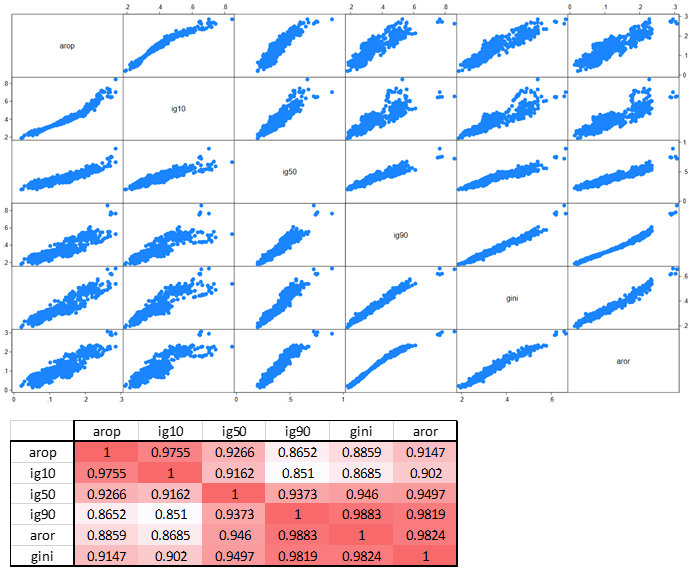
The correlation matrix (Fig. 4) established on 864 LIS samples (LIS version 14/03/2024) shows significant correlations between isoginis, the traditional gini, and indicators like arop, people “at risk of poverty” below 50% of the median, and its symmetric, say aror, for “at risk of richness”, above 200% the median. The strongest correlation with isogini(0.1) is arop, and the strongest with isogini(0.9) is aror. The isogini for the median is intermediate, correctly but imperfectly correlated with the others. This confirms that isogini(0.1) is a gini for the poor, and isogini(0.9) for the rich. Surprisingly, the traditional Gini coefficient is best correlated with inequality at the top: empirically, the Gini index, often misrepresented as an overarching measure of inequality, is primarily an average level of inequality with stronger ponderation at the top. The traditional gini has merits, being in average correctly correlated with others; anyway, gini is relatively limited to measure the concentration of inequality at the bottom of the distribution, where isogini(0.1) provide more consistent measurement with, for instance, arop. The R2 correlation between poverty (arop) and gini is only 83.6%, confirming earlier findings of Allegrezza et al. (2004: 269).
Figure 4. Correlation matrix graph of the isoginis, gini, arop and aror
International comparison: Sweden is now a “normal” European Union country, no longer the Nordic model
Examining data from 25 countries within the Luxembourg Income Study (LIS) database, spanning at least 25 years after 1975, the four indicators isogini and gini are systematically analyzed. A spectrum of distinct patterns is apparent, focusing initially on structures and subsequently on trends (Fig. 5).
The four indicators exhibit large overlaps in countries like Austria, Switzerland, Luxembourg, Mexico, the Netherlands, etc. The proximity of the four indicators means their distributions are close to Fisk distribution of parameter gini.
Across many other countries, inequality is more often stronger at the bottom end than at the top, typically when the red line isogini(0.1) is above the others. This is particularly pronounced in Canada, Denmark, Norway, Sweden, the United States, and in more recent years in Spain, Israel, Poland, Romania, and Taiwan. This means a prevailing trend where inequality is particularly concentrated at the bottom. Ironically, even though pro-poor redistribution policies logically incur lower costs to the state budget compared to middle-class policies, nowadays the poor are falling farther behind in those countries. The trends of recent decades reveal a deepening gradient of income within the lower percentiles, with intensified inequality at the bottom.
Conversely, inequality among the near-rich tends to be relatively lower in comparative terms, notably observed in countries such as the United States, Australia, Canada, Denmark, Finland, Israel, Norway, Romania, and Sweden. In these nations, constraints on the incomes of the affluent are comparatively stringent, either through progressive taxation measures or (in a subtle way) exemptions on high-income declarations, which are often prevalent in countries where long-term capital gains enjoy generous tax optimization. Moderated income inequality for the near-rich might hide massive wealth expansion at the top (Chauvel 2022). In some cases, such as Chile, the blue line representing inequality at the top surpasses other indicators. Uruguay exhibits the same pattern, along with several other countries not represented in Fig. 5. In Chile, inequality at the bottom is relatively moderated in contrast to the pronounced disparities observed at the upper echelons of the income distribution.
Figure 5. Isogini(p) for p=0.1 (red), 0.5 (green), 0.9 (blue), and the traditional gini (grey), 25 countries 1975-2022
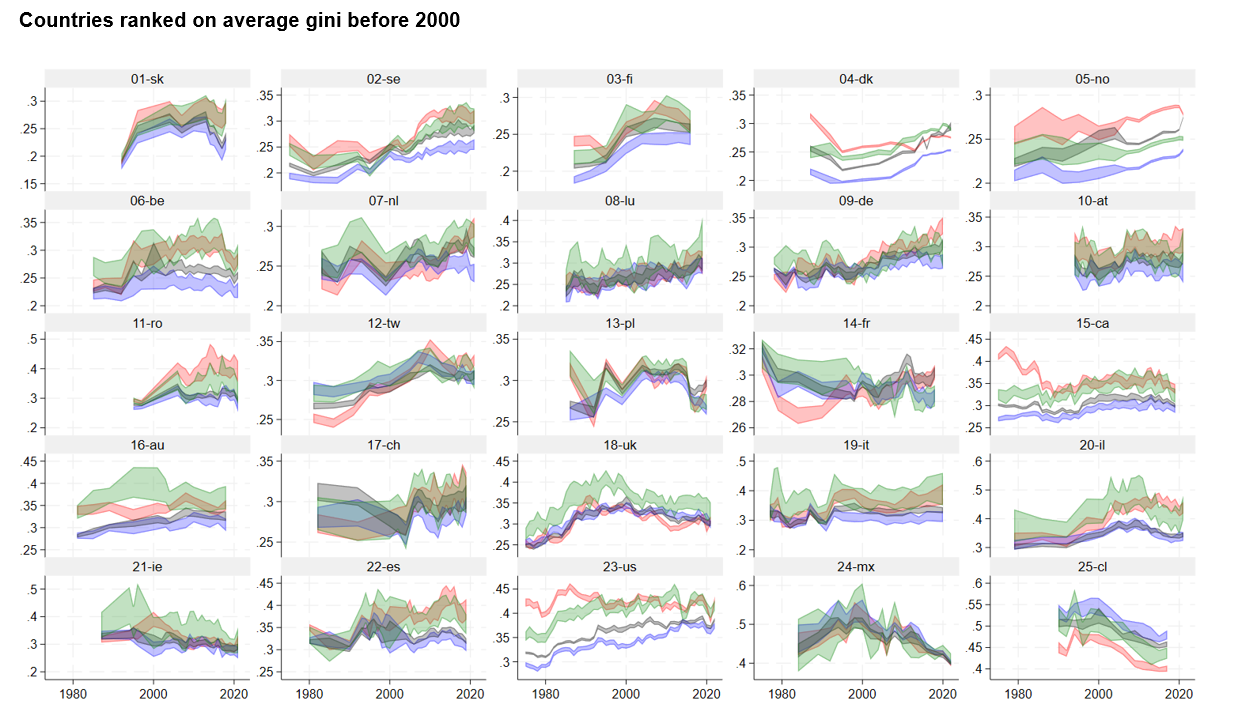
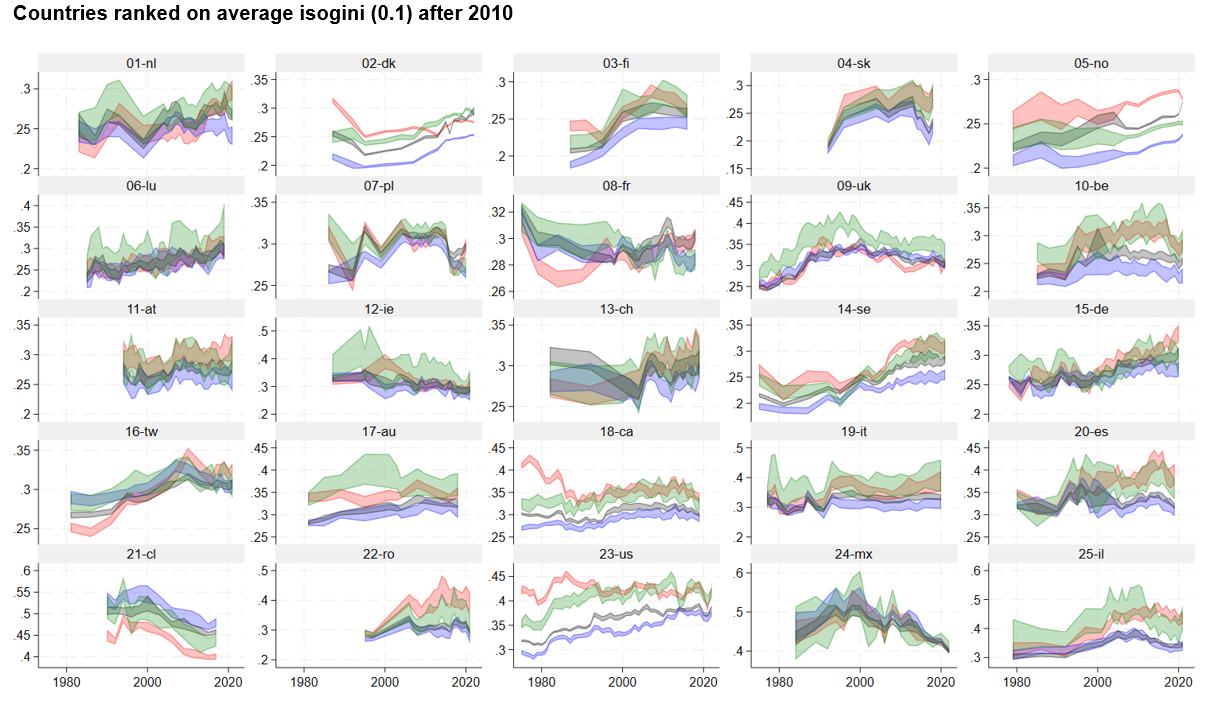
This complexity is confirmed and show significant inconsistencies between top and bottom inequality when rankings of inequality are compared (Fig.5). Countries’ rankings based on their average gini before 2000 fit with the blueprint of welfare regime literature: Nordic countries (and some Eastern Socialist ones) are more equal than Bismarck welfare regimes, then come Southern European versus English-speaking Liberal countries, and at the end Latin American countries. The same countries ranked on average isogini(0.1) meaning inequality at the bottom, averaged after 2010 onwards, produce rather different rankings. The first equal country becomes Denmark, and the last Israel, but between the ranks are considerably altered, with the U.K. in a more equal position, compared to Sweden that is less than average for its lower tail inequality. Now, Sweden’s profile of inequality after 2005 aligns more closely with continental countries like France or Germany, and notably show higher inequality than in Denmark and Norway.
In the majority of countries, the Gini coefficient (represented in grey) and isogini(0.9) exhibit overlap. If not, gini is between the three other lines. It had been noticed that the red line is often above the others, but there are exceptions, like in Chile where the blue line is above the others. In certain instances, notably observed in countries such as the United Kingdom, Austria, Belgium, and Israel around the year 2005, the green curve representing inequality at the median is elevated above the others. This means polarization (see below). This means the distributional shapes are diverse, denoting different configurations of concentration of inequality.
Shapes of distributions: understanding slope of concentration of inequality and polarization
These diverse configurations suggest two additional indicators of shapes of inequality, based on the isoginis.
The first one,π, is an indicator of polarization, understood as a specific concentration of inequality at the center compared to the rest, otherwise a strong isogini(0.5), denoting weaker median density.
π=isogini(.5)-½( isogini(.1)+ isogini(.9))
should be considered as a convenient polarization indicator, more accurate than the Wolfson’s (1994) since it detects if the median isogini is specifically strong compared to the extremes. In the case of the United Kingdom, this stretch at the median is associated with the Thatcherian era and its subsequent policies (1980-1997), initially leading to a major polarization at the median before spreading to the lower and upper segments, followed by a relative moderation in inequality after 1997. A similar significant hump in the 1990s in the isogini(.5) is visible in Australia and Ireland and in the early 2000s in Israel.
The second one,∑, is the slope of inequality from the poor to the rich, expresses (if positive) the relative concentration of inequality at the top compared to the bottom. Negative values denote high inequality at the bottom.
∑= (isogini(.9) – isogini(.1))/(2logit(.9))
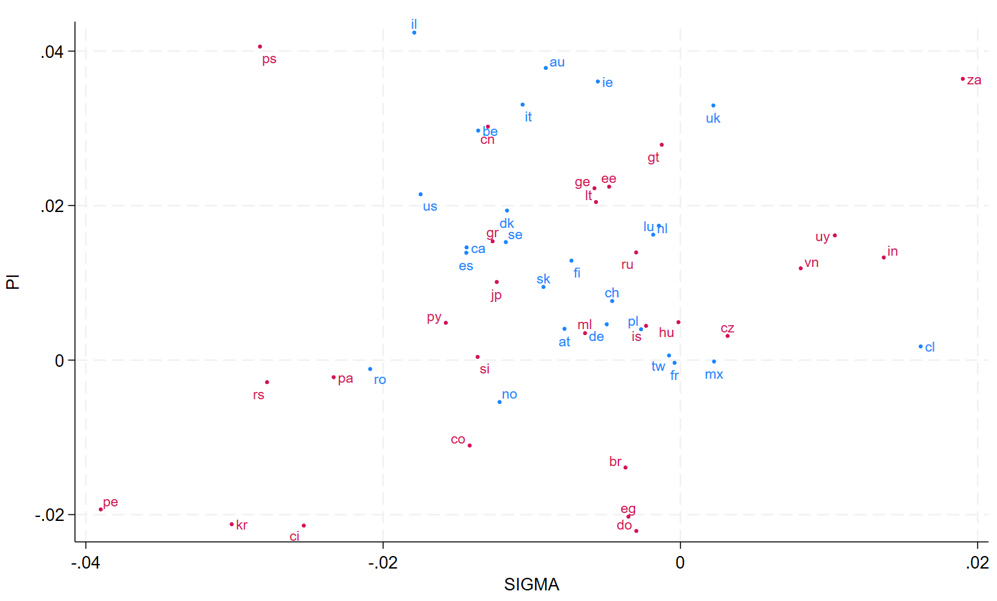
In Fig.6, the horizontal axis denotes sigma the slope of inequalities, meaning the rich are far richer than the poor are relatively poor: Chile, India, South Africa, and Uruguay, are typical of extreme richness of the rich. Conversely, negative values of sigma mean the relatively deeper poverty of the poor: Peru, South Korea, and Serbia, are typical of this trend. The vertical axis represents polarization, where countries like Israel, Palestinian Authority, Australia, and Ireland, are typical of high polarization. Lower values mean relatively higher density at the center, compared to the isoginis at the extremes. The two dimensions are independent, meaning the two indicators provide complementary information in the distribution.
When the distribution is a Fisk, the values of pi and sigma are zero. Positive polarizations are more common than negative ones; negative slopes are more usual than positive, but Fig.6. confirms the large diversity of sigma and pi indicators, and that the point (0,0) belongs to the domain of variation of the coefficients.
Figure 6. Average values (2000 to most recent year) of the slope of inequality, sigma, horizontal, and polarization, pi, vertical, for the main 25 countries (blue), plus the 28 other LIS countries (red)
The three isogini, sigma and pi indicators collectively complete the traditional gini, and often provide significant information on distributions, more than nuances of complexity: it is the case of recent specific changes observed in Norway: the significant increase in gini and isogini(.9) in 2021 coincides with a significant decline in isogini(.1), highlighting growing concentration of inequality at the top. This confirms the relative independence of the indicators: isoginis have sometimes significantly opposite directions. The innovative isogini technology offers a robust framework for assessing shapes and changes in inequality.
For example, in the United States, it initially detects a substantial and significant decrease in inequality at the lower end, as measured by isogini(0.1), from 2019 to 2021. However, it subsequently reveals that this progress has been almost entirely overturned by 2022. Similarly, recent trends in Germany and the Netherlands suggest troubling signs of marginalization within the lower strata of income distribution.
This paper received financial support from the Luxembourg FNR Fonds National pour la Recherche project PEARL/IRSEI. I would like to extend my gratitude to the entire LIS team, especially Teresa Munzi, Jörg Neugschwender, Heba Omar, and Piotr Paradowski, for their valuable support in data management, feedback, and other assistance, and also Philippe Van Kerm for a precise review of the Stata ssc install isogini module
1 The most visible pieces include the Nobel price Angus Deaton and Anne Case who criticized the Gini index as a biasing tool https://www.prospectmagazine.co.uk/ideas/economics/39791/rebottling-the-gini-why-this-headline-measure-of-inequality-misses-everything-that-matters whilst Francisco Ferreira provided a nuanced support to the old tool https://blogs.worldbank.org/developmenttalk/defense-gini-coefficient
2 For over a decade, starting from 2005 (the last sample for Sweden) and continuing until the LIS data release of spring 2023, Sweden remained a blind spot due to regulations that prohibited the sharing of microdata. However, now, decades of significant transformation in Sweden are unveiled.
3 The webpage https://louischauvel.org/surface_SEnew.html provides an interactive (mouse movable) 3D density Python graph of Sweden 1970-2020. The three axes are respectively: x, period from 1 to 50; y income from 0 to 50, 20 denoting the median (y is trimmed at 2.5 times the median); and z, the standardized density of the distribution.
References
| Allegrezza, S.; Heinrich, G; Jesuit, D. (2004). Poverty and income inequality in Luxembourg and the Grande Région in comparative perspective, Socio-Economic Review, 2:2, pp. 263–283, https://doi.org/10.1093/soceco/2.2.263 |
| Blesch, K., Hauser, O.P. & Jachimowicz, J.M. (2022). Measuring inequality beyond the Gini coefficient may clarify conflicting findings. Nat Hum Behav 6, 1525–1536. https://doi.org/10.1038/s41562-022-01430-7 |
| Chauvel, L. (2016). The intensity and shape of inequality: the ABG method of distributional analysis. Review of Income and Wealth, 62(1), 52-68 https://doi.org/10.1111/roiw.12161 |
| Chauvel, L. (2022). “The Extreme Wealth-Income Ratio (EWIR): the Joker Smile Curve (JSC) and the New Age of Extremes,” LWS Working Paper Series, No. 39, LIS Cross-National Data Center in Luxembourg. |
| Dagum, C. (1977). “A New Model of Personal Income Distribution: Specification and Estimation,” Economie Appliquée, 30, 413–36. Fisk, P. R. (1961). “The Graduation of Income Distributions,” Econometrica, 29, 171–85. |
| Gini, C. (1914). Sulla misura della concentrazione e della variabilità dei caratteri. Atti del Reale Istituto Veneto di Scienze, Lettere ed Arti, LXXIII, parte II, 73, 1203–48. |
| Gornick, J. and Jäntti, M. (2013). Income Inequality: Economic Disparities And The Middle Class In Affluent Countries, Stanford, Ca, Stanford University Press. |
| Osberg, L. (2017). On the Limitations of Some Current Usages of the Gini Index. Review of Income and Wealth, 63: 574-584. https://doi.org/10.1111/roiw.12256 |
| Tam, T. (2016). “Academic Achievement as Status Competition: Intergenerational Transmission of Positional Advantage among Taiwanese and American Students.” Chinese Journal of Sociology, (2):171-193 https://doi.org/10.1177/2057150X16638600 |
| Wolfson, M. (1994): “When Inequalities Diverge,” American Economic Review, 84, 353–358, https://www.jstor.org/stable/2117858 |